Theme Typeface: A Web Designer’s Honest Take
It was one of those projects where the client kept using the word “warmth.” They wanted their new boutique coaching site to feel inviting, confident, and handcrafted — without looking like they had tried too hard. The logo was already polished, but the typography on the homepage felt sterile. I needed a headline font that could carry emotion and presence from the first viewport. That is when I decided to test Theme, a beautifully expressive typeface from the Script Amp collection, in a real layout.
Dropping a script style into a web project always makes me cautious. The wrong script font can look clunky at small sizes, overly ornate for modern layouts, or simply out of place on a responsive screen. But Theme had a certain controlled elegance that felt different. It was polished enough for a professional brand identity, yet loose enough to feel personal. I built a simple landing page to try it properly — and what I found changed how I approached the entire brand identity.
First Impressions: Bringing Theme into a Landing Page Layout
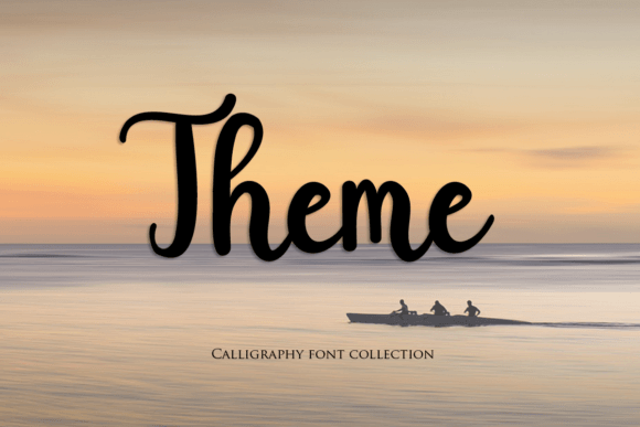
From the moment I placed Theme into the hero section, it was clear this font was built for display use. The letterforms carry a sophisticated rhythm without feeling disconnected or too rigid. It sits confidently at large sizes, making it an immediate candidate for headline typography on a homepage, an online store banner, or a campaign landing page.
I tested it over a warm-toned background image with a soft overlay, and the contrast was lovely. The Script Amp classification makes sense here — this is not a quiet, everyday handwriting font. It has presence. The ligatures and subtle swashes brought a handcrafted quality to the headline that I usually only see in custom lettering. For a web designer working with creative professionals, wedding vendors, or artisan product brands, Theme offers a quick path to a high-end editorial feel without needing to outsource logo lettering.
Where I found myself pausing was during mobile testing. At 48px and above, the font looked gorgeous. But as I sized it down for smaller viewports, some of the thinner strokes began to compress. This is common with refined script typefaces, but it means you need to be intentional about your scaling. Using a slightly larger minimum font size on mobile and adding a bit of letter-spacing helped preserve its readability without losing the handcrafted character.
Responsive Readability and Building Visual Hierarchy
One of the biggest challenges with decorative typography in digital design is maintaining a clear visual hierarchy. A script font that works beautifully as an H1 can completely fall apart when used in supporting roles. I experimented by using Theme for the primary headline, then pairing it with a simple sans serif for subheadings, body copy, and navigation.
The contrast was immediate and effective. Theme drew the eye exactly where it needed to go — the value proposition and the call-to-action. I avoided using it for anything smaller than 28px, and I never let it carry body text. On mobile, I reduced the hero headline size and gave it more padding to breathe. The font still felt impactful, but it did not overwhelm the smaller screen.
For web designers, the lesson here is straightforward: use Theme as an accent, not a workhorse. It performs best when it leads the visual story, not when it is filling out paragraphs. When I previewed the layout on a tablet, the contrast between the expressive script and a clean sans serif created a natural reading flow. Visitors would scan the bold headline, then comfortably read the supporting text in a more neutral typeface. That kind of intentional hierarchy builds trust and keeps users engaged.
Where Theme Shines and Where It Needs Careful Handling
After testing Theme across several layout concepts, I found its sweet spot in a few specific use cases:
- Hero section headlines and landing page titles — This is where Theme feels most at home. It adds warmth and a premium, custom-lettered feel immediately.
- Call-to-action banners and section headers — A short, punchy phrase in Theme can anchor a page section and give it emotional weight.
- Online shop branding elements — For boutique product pages, especially those selling handmade goods, stationery, or home decor, Theme brings a physical, tactile quality to digital storefronts.
- Quote displays and testimonial highlights — Using Theme for a pull quote adds editorial polish and visual variety.
On the other hand, there are clear areas where Theme is not the right choice. Small navigation labels, footer text, form input labels, and any dense informational content become difficult to read. The decorative nature of the font, while beautiful at scale, creates friction when users need to scan quickly. I also found that using it on busy or highly textured backgrounds required extra care — a subtle shadow or a cleaner overlay helped the letterforms stay legible.
If your project involves heavy accessibility requirements, dense dashboards, or lengthy product descriptions, reserve Theme for the moments that need visual emphasis and let a simpler font handle the heavy lifting. This selective approach keeps the design clean and the user experience comfortable.
Font Pairing and Digital Brand Consistency
No font exists in isolation, and Theme is a font that practically begs for a strong partner. During my testing, I paired it with a clean, neutral sans serif for body copy, buttons, and secondary headings. The contrast between the expressive script and a restrained sans serif created a balanced brand voice — creative but professional, warm but structured.
For a more editorial digital identity, pairing Theme with a refined serif could also work nicely, though it may compete for attention if both fonts are too expressive. I preferred the simplicity of a humanist sans serif like Proxima Nova or a geometric option like Montserrat. The key is to let Theme lead the visual tone while the supporting font provides clarity and readability across the rest of the site.
When I carried this pairing into the blog section and about page, the brand consistency was immediately noticeable. Theme appeared in section headers and the main CTA, while the neutral font handled the paragraphs, list items, and metadata. This repetition of contrast created a visual rhythm that felt intentional and confident. For web designers building brand kits or template systems, defining these roles early saves significant overhaul work later.
Technical Considerations and Licensing for Web Projects
Before adding any font to a real web project, I always check technical compatibility and licensing. Theme is part of the Script Amp collection, and the Fonts category typically offers comprehensive licensing options, including web standards. Always confirm that your license covers @font-face usage and check the page view limits if applicable.
From a performance standpoint, serving font files in modern formats like WOFF2 is essential for fast load times. I also recommend subsetting the font to include only the characters you need for your specific content, which reduces file size and improves page speed. If the font includes alternate glyphs or swashes, make sure your CSS or web font service allows you to access them easily — they can make a huge difference in the polish of your headlines.
For designers working with clients, clarifying the web licensing cost upfront is important. Some premium fonts require separate licenses for desktop, web, and app usage. Making sure Theme is cleared for the scope of your project — whether it is a personal portfolio, an e-commerce store, or a client website — protects everyone involved and ensures the font remains a reliable part of your brand toolkit.
In the end, Theme is a wonderful addition to a web designer’s typography palette when handled with intention. It brings a tactile, handcrafted warmth to digital spaces that can feel cold with overused system fonts. By using it selectively, pairing it wisely, and respecting its display nature, Theme can elevate a brand’s online presence and create a lasting visual impression.